Category: Behavioral Economics, Self-driving
May 28
Why are self-driving cars so ugly?
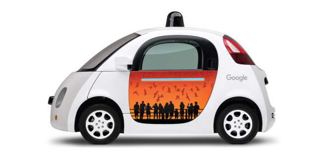
Pretty they ain’t. And they don’t look like hot rods either. Let’s admit: they are ugly ducklings. I am talking about Google’s self-driving cars. They come in tha shape of an egg on wheels with some funny colors. And Google even seems to emphasize that with putting some funny art on the doors. But why are they so ugly? Has Google no sense for design?
It’s right, the Google cars are ugly. If you had to decide what car to choose from in the dealership, we wouldn’t go for them. But we mustn’t overlook the fact that the product car is changing. For 100 years the business model was to buy a car and use it exclusively for ourselves. We also had to find parking, maintain the car, fill it up, and pay all the fees. A significant percentage of our household income goes into the car. And cities with few parking spaces and regular traffic jams increase pressure on car ownership. It comes as no surprise that many city dwellers don’t own a car or would get rid of it, if there were a simple and comfortable solution.
A solution is nearing with the advent of self-driving cars. Combined with sharing services such as Uber or Lyft it becomes easy, fast, and cheap to move within the city. And when i choose a taxi or Uber it doesn’t matter how the car looks like. Ten minutes spent in a Prius or in a Mercedes taxi doesn’t matter. Also if the color is red, blue or yellow. It’s more important to get quickly and safe to my destination, and that there is a charger for my smartphone in the car. Now self-driving cars very likely won’t be owned by individuals, but by companies that run such services. How the cars look like is of no importance.
Autonomous cars are robots. How do we feel about a black car with tinted windows standing at a crosswalk and revving up the engine? We assume there’s a douche-bag behind the steering wheel. But when an autonomous car revs up the engine like this, we feel fear. We immediately think of ‘Terminator’. We are afraid and try to avoid such a technology.
If such a car looks cute and not threatening – like Google’s Mini-cars – then the barrier to use it is lowered. We are not afraid anymore. We are more likely to interact and us it, instead of a threatening looking and threatening behaviors showing car. The requirements for car designs suddenly change. Not a hot rod and cool, but a cute and comfortable design is required.
The round shaped design of Google’s mini-car has some additional advantages. It allows the sensors for autonomous drive to see every spot around the car. The car has no hidden corners through equipment and design-elements. That the front of the car looks like a face is nothing new. Today’s cars aim at making the front look friendly. But the front offers more options than just looking like a face. It can also be used for communication with pedestrians. Where do I usually look when I meet a car at a crosswalk? Today I look in the face of the driver, to get a clear signal. But with a self-driving car with or without passengers I need to look at something that looks like a human face on the car in order to communicate.
These are reasons why design requirements for self-driving cars change the game. A hot rod and cool design communicates one thing: this car is not self-driving. It’s old technology. The driver must be somebody older, one is behind the current state of technology. As much as we associate flip phones with senior citizens.
Here are videos about the design of Google’s self-driving cars.

Recent Comments