Category: Culture, Design, Self-driving
Jul 29
Why the right focus is important for innovation
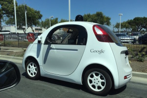
Is design important for innovation, and if not always, when is it not? A conversation about me spotting the Google self-driving mini-car for the first time in the wild lead to discussion about the right priorities and the importance of design for innovation.
Worst car design ever …
 This was the gut reaction of one of my former colleagues and Facebook friends when he saw the picture of the car. And here a heated discussion started that showed two things:
- initial reaction to an innovation is negative
- the focus is on something that is (nearly) irrelevant to the real innovation problem
But let’s analyze that step by step:
Negative reaction
The phrase “Worst car design ever ...” is a perfect example of what I have discussed in a recent post titled Words that kill innovation. It’s a typical “Yes, but…” reaction. “Yes, I see it but it’s ugly.”
There is not much to add for now to the article that I wrote a few days ago, so let’s move on the second issue:
Wrong Focus
This may be a more difficult argument to tackle, because what’s wrong with a focus on good design? After all, Apple’s focus on design has brought a shift in many companies realizing the importance of design. And it’s true that European car manufacturers really have a leg up against everyone else in car design. That’s what they know. That’s what they do. And that’s what they like to do and where they can feel good.
Low hanging fruits
But it’s also a low-hanging fruit. It’s not as hard as a problem as really making a car drive autonomously. And that’s why traditional car manufacturers have not gone after the hard problem. It’s easier to design a pretty car than to solve the technical issues of a car knowing where it is, crunching big data, using all types of sensors, recognizing traffic lights, road signs, and the environment and making sense out of it under a variety of circumstances. Google’s Chris Urmson gave a great and partly hilarious TED talk a few weeks ago. One of the highlights that shows with what situations an autonomous vehicle has to deal with was the senior in a wheel chair chasing ducks on a the road.
And I don’t want to even get started on the legal challenges of getting permits to having an autonomous car driving on public streets. The fruits of all that hard work will take years to harvest. This all makes it understandable why focusing on making the car prettier or adding incrementally better technology to the car has been the focus for many many years.
But disruptive innovation doesn’t come from low-hanging fruits. And everyone is doing those low-hanging fruits. Your advantage is only short lived, if ever you will realize an advantage at all. And this is what Google does in their Google X projects: go after the hard problems. The moonshot projects that don’t bring just 10% improvement, but at least improvements of a factor of 10x.
But where is the design now?
Design follows disruptive innovation
Sometimes design follows disruptive innovation, because you may not know from the beginning, where you will go and what you will need. While Google started out with regular Toyota Priuses and then the Lexus SUVs as their platforms to host their technology, often literally duct-taped to the cars, the place of sensors and electronics on a car is unclear at the beginning and may shift significantly during the development process.
 Here is an analysis of the design from Tesla. They started out with a standard Lotus-roadster platform to bring in the battery and technology that they needed. While they adapted the design to some extent, it still fit into the platform. Learning from that model, they could then design the platform for the Model S. And this changed what car designers could play with. No engine, no transmission, and no exhaust pipes, and an all-aluminum frame allowed them to use newly available space for more comfort and other uses. A large trunk allowed to place seats in there for kids, and the missing transmission inside the car made it way more spacious.
The self-driving car now needs additional elements, such as the Lidar-system on top of the car – and the current state of Lidar-technology makes it look cumbersome – and sensors on all sides, so they get integrated in the back mirror and other places. Inside the car is no steering wheel anymore. Opening up space that can be used otherwise.
But until the technology is working – and it seems it does now – you don’t know what parts you need where. Once that is done, the designers come in and suddenly have a lot to play with. As they could with Tesla, as they can now do with Google’s self-driving car.
Now other companies apparently have been very successful with launching well designed disruptive technology right from the beginning, such as Apple with the iPhone. That is true, and the design certainly played an important part in the success of the iPhone. But first, there was so much other technology involved that was disruptive, and second, this was a mass market launch. Google’s self-driving car that we see today is not yet a mass market vehicle. The focus of these test-vehicles is to gather more real-live use data and feedback from regular people, including those who cannot or do not want to operate a car today (disabled, young, elderly, or those without driver’s license).
So it’s OK for now to now have the car be super designed from an aesthetic point of view. But there is design that went into the car’s user interface, so that a blind person, a teenager, or a senior citizen can tell the car where to go.
The uncanny valley
 A final note on the current aesthetic design on the car goes into why it’s ugly from the outside and looks so childish? And this is because we are entering new territory: Robotic vehicles. For many people this sounds threatening.When Helen Greiner, co-founder of iRobot, did first customer interviews of whether they’d like robot vacuums, people immediately said no. As it turns out what they had in mind was a human looking robot operating a vacuum. When shown the actual design – the now well-know iRoomba – people changed their mind. “Oh this is how it looks like? Of course I would use this.”
As it turns out, people even gave it names, made dresses, and felt an emotional connection with it.
That’s why Google decided to make the cars look cute and less threatening. If Google had decided to make the cars look like, lets say an aggressive looking monster car, then the typical “a**holeness” that many relate with some car owners would be put on a machine. And that is sooo not cool with people. This would be frightening and brings us to a Terminator-style that people fear. Additionally, the self-driving cars are designed to behave very politely, like a well-mannered gent or lady, giving others the right of way in ambiguous situations, or leaving enough distance between the car and pedestrians or other cars.
Summary
This little conversation that started this blog shows how small elements can influence how and if you innovate. Each element may be small enough, but thrown together and you will actively stop innovation and people who want to be innovative. What we can learn is to pay attention to the choice of words someone uses in context of an innovation process, and where the focus is. Is it on the low-hanging fruits? Is it on where people are good at? Or is it on problems that are really hard? This will give you some guidelines on whether you are focusing on a really disruptive topics and whether you will be successful.

Recent Comments